National Park Service Website Redesign
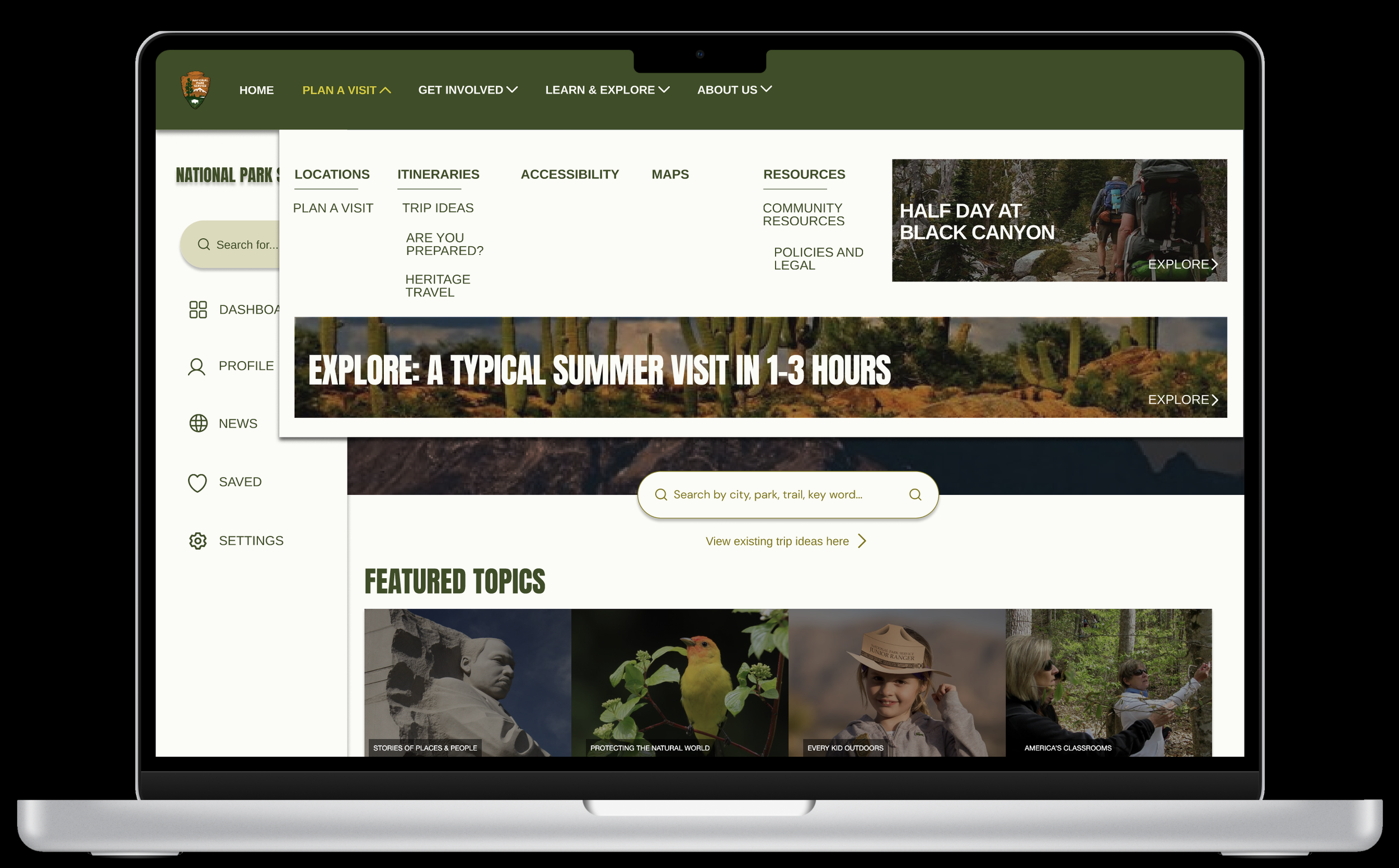
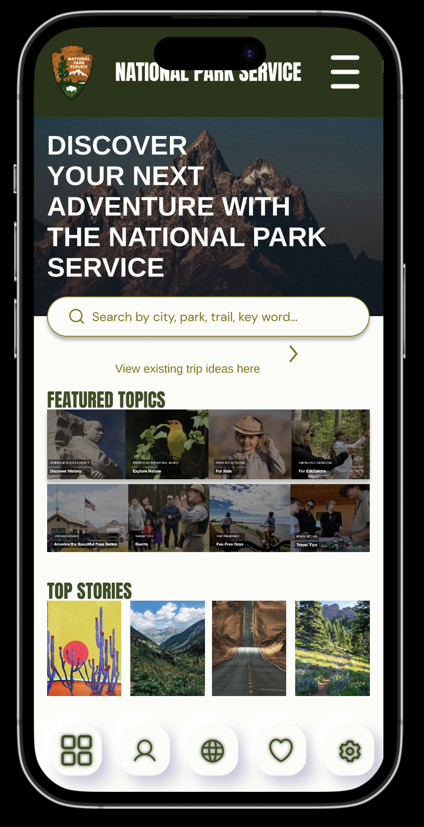
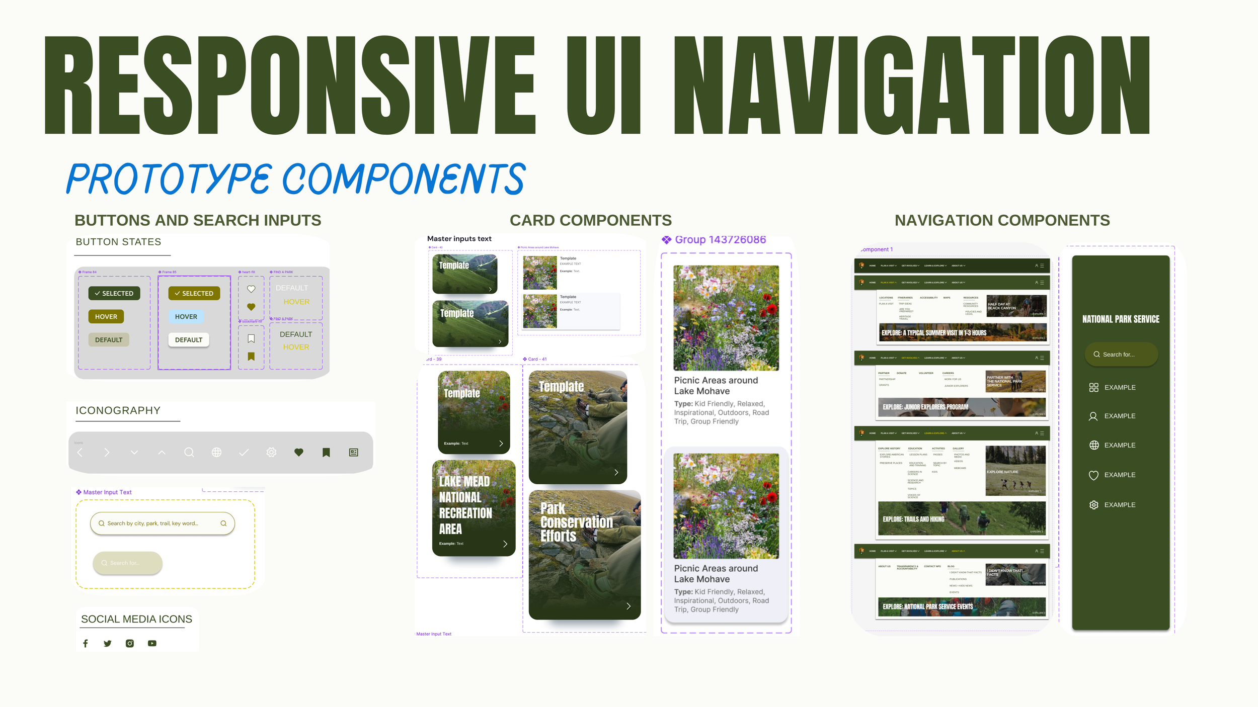
This project had its challenges, especially with navigating and organizing all the information on the National Park Service website. However, it was rewarding to see how restructuring the content made the site more intuitive and user-friendly. I particularly enjoyed working on the UI, creating components, interactions, and cards to bring the website to life.
If I were to do this project again, I’d dedicate more time on user flow. Understanding how users move through the site is crucial for optimizing their experience. Additionally, I would have extended my research on competitor websites to see what works and what doesn’t for them and identify angles that could work for this website. This would help identify best practices and areas for improvement.
Closing Remarks